Your Guide to a Mobile Friendly Website That Beats Google
Google first announced its decision to prioritize mobile sites in 2015. Back then, 39% of internet browsers used a mobile device to explore the web. That number has grown by nearly 40% to 54.67% in Q4 2023. (Statista)
In July 2024, Google finished its mobile-first indexing roll-out and killed its desktop indexing tools. The message to business owners is clear, pay attention to your mobile performance to beat Google and your competition.
Our SEO team has simplified the mobile optimization tips provided by Google, Apple and our development teams for you. We encourage you to use these to build a website that can beat Google — catapulting you ahead of your competitors.
Now, let's dive into the best mobile optimization, mobile UI, and web design advice for your business.
Update: This blog was first published in November 2021. We updated it in September of 2024 to give clients current, useful mobile SEO advice.
How Does Google Define a 'Mobile-Friendly' Website?
In general, a mobile-friendly website provides a good user experience to anyone using a mobile device. In SEO, a mobile-friendly website provides a good experience to Google's mobile indexing algorithm, 'Googlebot Smartphone.'
So, we define a ‘mobile-friendly’ website as the result of a two-step process. First, use development techniques that make indexing easy for Googlebot mobile to bring users to your business in search. Second, create truly helpful E-E-A-T SEO content nestled inside a clear user interface (UI).
We'll cover the best mobile development techniques and UI design best practices below. Learn more about E-E-A-T SEO in our guide, 'An Up to Date SEO Guide to E-E-A-T Content for Google.'
Technical Mobile SEO Tips
This section will cover the basics of technical SEO for mobile devices. Unfortunately, we can't include everything we know about technical SEO in a single article.
For now, let's start learning about Google's best practices for mobile-first indexing.
1 MAKE SURE YOU LAZY LOAD CONTENT CORRECTLY
Lazy loading refers to the process of loading large content, like images, only when needed. Ensure all lazy loaded content loads when it enters the viewport for proper indexing, instead of when a user completes an action on your site
Google won't use tools that require interaction when indexing your web pages. Think moving price sliders, playing embedded videos, clicking to expand an FAQ, or zooming in on a map. This means that setting your content to lazy load on user interactions effectively hides it from Google. Instead, always lazy load content when it enters the viewport.
2 USE HIGH-QUALITY, PROPERLY OPTIMIZED IMAGES
Google requires high-quality images, not the highest-quality images on mobile. Many business owners forget about mobile load times and use the best possible images instead. Smartphones can only display small images and they will struggle to render larger files.
Optimizing your website for fast mobile load times is crucial. We recommend uploading images that:
- Are smaller than 500kb in file size
- Are smaller than 1920 pixels on the long edge
After uploading, compress your images and convert them to .webp files. WordPress users can install a plugin to compress and convert images automatically. Business owners with a Wix, SquareSpace, WebFlow, or custom website should compress their image assets before uploading.
3 OPTIMIZE FOR MOBILE CORE WEB VITALS
Run a PageSpeed Insights test to understand how Googlebot sees your website. This test will provide desktop and mobile results. For SEO purposes, your mobile score is the only thing that matters. The mobile score you receive will rank your website and provide ways you can improve.
The advice Google provides with a PageSpeed Insight's report is for developers, so don't be afraid to ask for help. We also encourage you to read our guide to optimizing for Core Web Vitals.
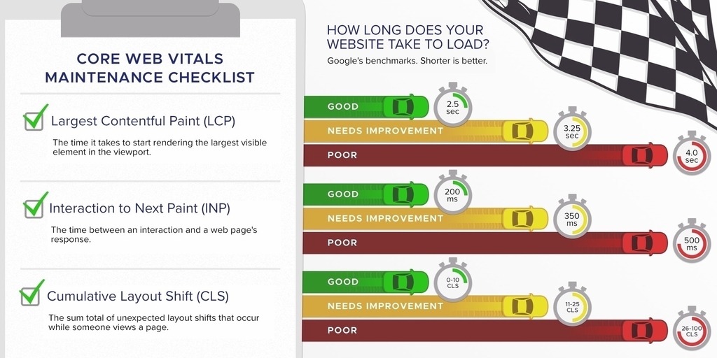
To quickly break things down, Core Web Vitals take three key measurements. Those are:
- Largest Contentful Paint (LCP): The time a page's most significant element take
s to load. - Interaction to Next Paint (INP): The time a web page takes to respond to user interactions.
- Cumulative Layout Shift (CLS): The shifts in a page's layout that occur during its lifespan.

The faster, more responsive, and predictable your pages are, the better your Core Web Vital's score.
4 DON'T LET ADS RUIN THE USER EXPERIENCE
If you place ads on your website, they become a key factor you need to optimize for mobile SEO. Google provides a guide they call the 'Better Ads Standard' for websites that display ads.
The Better Ads Standard provides a series of dos and don'ts. According to Google:
- DO display a small, sticky ad banner at the top or bottom of your website
- DO display small, static inline ads
- DON'T display pop up ads
- DON'T display large, sticky ads that users can't scroll past
- DON'T display ads that use flashing animations
- DON'T display video ads that autoplay
- DON'T display ads across more than 30% of any given web page
- DON'T display ads that cover the entire phone screen
To our team, Google's ad standards are actually great news. Their standards discourage the ads that make browsing the web on a smartphone miserable.
Tips to Design a Mobile Experience Your Customers Will Love
The final optimizations you need to beat Google relate to user interface (UI) and user experience (UX). UI refers to the webpage that the user interacts with. UX refers to the overall experience of that interaction.
A better UI and UX leads to more customer satisfaction and, oftentimes, a higher dwell time. User engagement is a ranking factor in Google's algorithm, so dwell time is a crucial metric to improve.
UI improvements are harder to give advice for without knowing your exact business. So, we will lean on advice from two massive influences on mobile design — Apple and Google. Both companies offer mobile UI design advice you can put into action right away.
Finally, we'll cover several pieces of advice from our team of mobile web design experts. We believe that this will give you the baseline knowledge you need to succeed in a mobile-first online world.
Apple’s Mobile UX Best Practices
Apple's mobile UX best practices share space mirror their guidelines for mobile apps. At their core, Apple states that good mobile design follows three pillars:
- Clarity: Your website must be easy to understand. Use fonts and text sizes that are legible on a small screen and make interactive elements look interactive. Finally, icon suites should follow industry standards for design.
- Deference: Your mobile web design must make the functionality of your site more clear. According to Apple, a minimalist design is often the key to a clear message. Clarity also dictates that content should fill the entire screen when possible.
- Depth: Your Mobile UX design should contain hierarchical layers. Create layers in your main navigation and website content that make the progression of information easy to understand.
Google’s Mobile UX Best Practices
Google has found that mobile users are far more goal oriented than desktop users. They expect to find exactly what they need as soon as they land on your website. Research has shown that mobile users search for what they need as they travel or directly beforehand. So, mobile web design needs to show them the information they're looking for quickly and clearly.
Google's Mobile UX guide recommends 25 techniques that cater to the user experience we've described above. 17 of which offer direct guidance about UI design for the modern mobile browsing experience. Google breaks their advice down into five categories:
- Homepage & Site Navigation
- Site Search
- Commerce & Conversions
- Form Entries
- Usability & Form Factor
We'll break down each piece of advice in its respective category for you below.
HOMEPAGE & SITE NAVIGATION
- Keep Calls-to-Action Front and Center: Customers come to your mobile website for your services, put your primary CTAs front and center.
- Keep Menus Short and Sweet: Menus that scroll will often feel overwhelming or cumbersome to mobile users. Simple, short, and to the point mobile navigation menus are easier to use and understand.
- Make it Easy to Get Back to the Home Page: Mobile users expect logos to link to a website's home screen. Make sure your logo does so to help customers easily navigate through your website.
- Don't Create Distracting Promotions: Limited available space restricts mobile design. Get to the point fast, keep ads under control, and refrain from using pop up windows whenever possible.
SITE SEARCH
- Make Site Search Visible: Display search bars separately from your website's expanding, mobile navigation. Next, either expose the text field or tell customers where to click it with an obvious search icon.
- Ensure Site Search Results Are Relevant: Use logic that displays the strongest results first. Your customers will appreciate knowing you have what they need, even if they wanted to sort by something different.
- Use Filters on the Results Page: Filters give your customers more control over search results. This naturally increases engagement and increases the chance that customers find what they're searching for.
- Categorize Your Products: Allow customers to shop by categories, like department, to help them find what they need.

Shipton's Big R's Mobile Site Search: Collapsed

Shipton's Big R's Mobile Site Search: Expanded
COMMERCE & CONVERSIONS
- Use Existing Information to Simplify Tedious Processes: Filling out forms is, to put it simply, a pain on mobile. If a user has already given you personal information like a billing address, offer to fill in forms automatically. Your customers will appreciate the automation.
- Make Buying From a Second Device Easy: Statista found that online shops have more traffic on mobile and more sales on desktop. This means that many users find what they want on their phone and complete the transaction later on their home computer. Offering a 'save to cart' function, or something similar, is an essential part of good mobile Ecommerce design.
FORM ENTRIES
- Use Well Sized Tap Targets on Forms: Forms can be hard to use on a mobile device at the best of times. Make sure the responsive layout of your website gives users the room they need to operate form controls.
- Provide visual calendars for date selections: Using a visual calendar makes choosing a date easy on mobile.
- Clearly Show Form Errors: Validate form entries in real time and mark errors with color and text. Load times on mobile are already slow, so missing a required field on a mobile device can be frustrating. Clearly communicated needs can prevent unhappy customers.
- Design Simple Forms: Only ask for the information you absolutely need and autofill information when possible. Forms on a mobile device are a huge barrier to conversions. So complex forms can easily lead to site abandonment.
USABILITY & FORM FACTOR
- Optimize Your Entire Site for Mobile: your mobile-friendly website design should be responsive. This means that the layout will change along with the screen size. A mobile design should do everything your desktop site aims to, but faster. The more efficient your mobile site is at delivering information, the better.
- Don't Require Pinch to Zoom: Mobile responsive design requires highly visible content and calls-to-action. Small text and design elements are simply too easy to miss and annoying to access via pinch to zoom. Design your UI so customers never need to guess where your content is.
- Make Product Images Expandable: Include large product images in your web design. Having the option to make a picture full-screen helps customers see what they're buying.
- Keep Your User in a Single Browser Window: Avoid adding CTA links that open pages in a new tab to increase dwell times. Navigation between tabs on a mobile device presents a barrier to entry that some customers won't overcome.
Our Professional Mobile UX Design Best Practices
Our mobile UX design team also has several best practices that we like to follow. These guidelines help us ensure the best mobile-friendly experience we can. Our sites are all custom-built using our in-house framework. So, we can optimize your site for the best mobile experience possible.
Here are three ways that we've made the mobile experience extra enjoyable for users.
1. Create Expanding Mobile Site Menus
Menus are critical in mobile design. Main mobile navigation needs to be large and easy to use, yet small enough to stay out of the way. The best mobile menus often use a 'hamburger menu,' or an icon users click use to access a drop-down menu.
Our web design team has adopted this approach in most situations. We find that it minimizes intrusive elements in a mobile user's experience.

JTech's Mobile Site Menu: Collapsed

JTech's Mobile Site Menu: Expanded
2. Position Important & Helpful Elements Close to Where a User Will Interact

OnSite Energy's Homepage
We do our best to place your site's most important UX elements on the right-hand side on mobile devices. Take OnSite Energy—one of our customers—as a great example.
Our mobile UI design team place the 'Get Quote' button near the bottom right of their site menu. This is as close to their customer's thumbs as possible—encouraging conversions.
3. Design Accessible Mobile UI
ADA compliance makes your mobile-friendly website easier for everyone to use. So, JTech bakes accessible design into every website that we build.
Accessible, mobile design means easy-to-read text, contrasting colors (see OnSite Energy’s website above), and large buttons. 26% of adults in the U.S. live with a disability. In other words, you will lose customers if your website isn't accessible. Not to mention, accessible web design is a legal requirement.
Using the WCAG's accessibility guidelines to evaluate your website is a good place to start. We also recommend hiring accessibility experts like us to make sure your website is as accessible as possible.
Tapping Back Around: A Summary of Mobile-Friendly Design
Let's sum up everything we've learned so far about mobile UX.
- Mobile-friendly website design is critical to the success of your website.
- Improve the technical, mobile SEO of your website to find customers
- Improve the mobile UI of your website next to increase dwell time
We hope you found our Mobile UX information and how-to guide helpful. To learn more about mobile-friendly website design or to get our web design help, reach out. We would love to hear from another potential lifelong customer.
REFERENCES
- Google to Lower Rank of Sites That Are "Mobile-Unfriendly" — JTech Communications
- Percentage of mobile device website traffic worldwide from 1st quarter 2015 to 4th quarter 2023 — Statista
- Mobile-indexing-vLast-final-final.doc — Google
- Overview of Google crawlers and fetchers (user agents) — Google
- An Up to Date SEO Guide to E-E-A-T Content for Google
- Mobile site and mobile-first indexing best practices — Google
- Fix lazy-loaded content — Google
- Page Speed Insights — Google
- Core Web Vitals: What They Are, Why They Matter, and How to Improve Your Score — JTech Communications
- Improving user experience with the Better Ads Standards — Google
- Dwell Time — Backlinko
- Secrets from the Algorithm: Google Search’s Internal Engineering Documentation Has Leaked — iPullRank
- UI Design Dos and Don’ts — Apple
- Principles of Mobile Site Design: Delight Users and Drive Conversions — Google
- Distribution of retail website visits and orders in the United States as of 1st quarter 2024, by device — Statista
- Why Are Some People Left-Handed? Scientists Identify Rare Genetic Variants That May Be Linked to the Trait — Smithsonian Magazine
- Why Should You Make Your Site Accessible? — JTech Communications
- Disability Impacts All of Us — CDC
- How to Meet WCAG (Quick Reference) — W3C Web Accessibility Initiative

