
JTech Brand Evolution
In 2011, I was tasked with designing a new logo for JTech — rebranding our Montana web development agency to mark a clean departure from the aging mark that had represented JTech since the 90s.
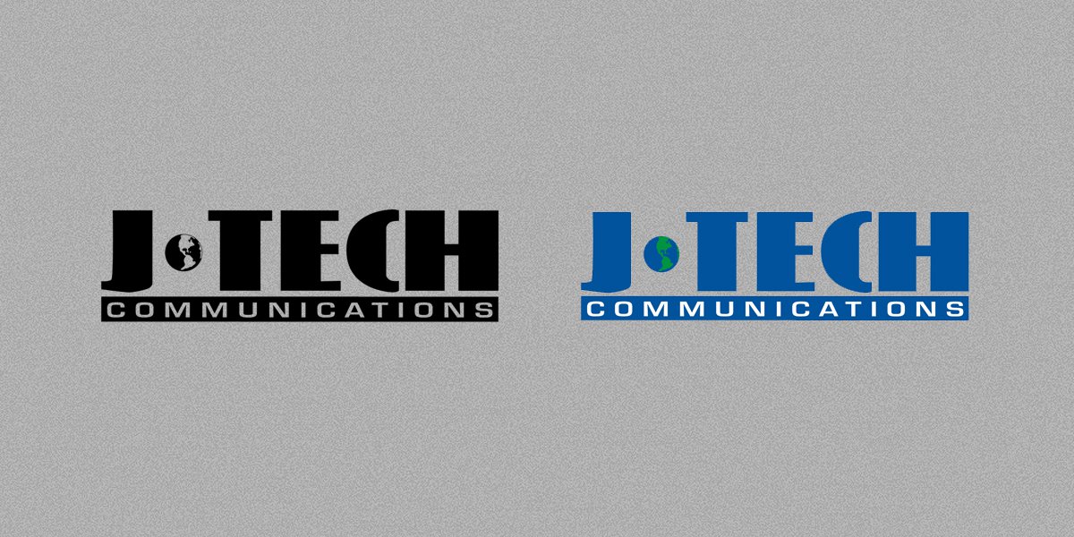 JTech's old logo.
Step 1. Taking inventory of the brand.
We took stock of what we liked about the old logo: it had a bold, stamp-like quality which gave it a strength and certainty that needed to be carried through in the rebranding. These same traits meant that it kept its visual integrity even when reduced to small sizes or given a textural treatment (as in JTech's Control Center).
On the other hand were the traits that we wanted to leave behind — for instance, the presentation of the logo as burned-in on digital parchment, matching our website's battered grimoire aesthetic. One deliberate departure we were making was away from skeuomorphism and analog metaphors in favor of a digitally native design system.
 Parchment treatment of old logo, circa 2010.
Furthermore, we were ready to be rid of the ubiquitous globe used in place of a hyphen. By this time, the globe as a shorthand for "internet company" was beyond threadbare. Further simplification was in order: removing "Communications" from the logo mark afforded a greater simplicity and allowed the logo to perform better in adverse circumstances (such as the small sizes or textured treatments mentioned above).
Step 2. New directions.
How to represent JTech's evolution? By 2011, all of the symbolic representations of website, internet, and communication had been overused to a degree that made any such iconography generic. Satellite dishes, radio towers, clouds, radio waves, and globes were no longer meaningful images for distinguishing a company's purpose — which led us away from direct metaphor and towards an abstract word or lettermark using JTECH or more simply, "JT."
The lettering is presented simply on a square, allowing clean interpretations of the branding in one-color (e.g. laserprinted) scenarios or reversed on white for use as a photographic overlay in addition to the full color variation of the logo.
Step 3. Refining the character.
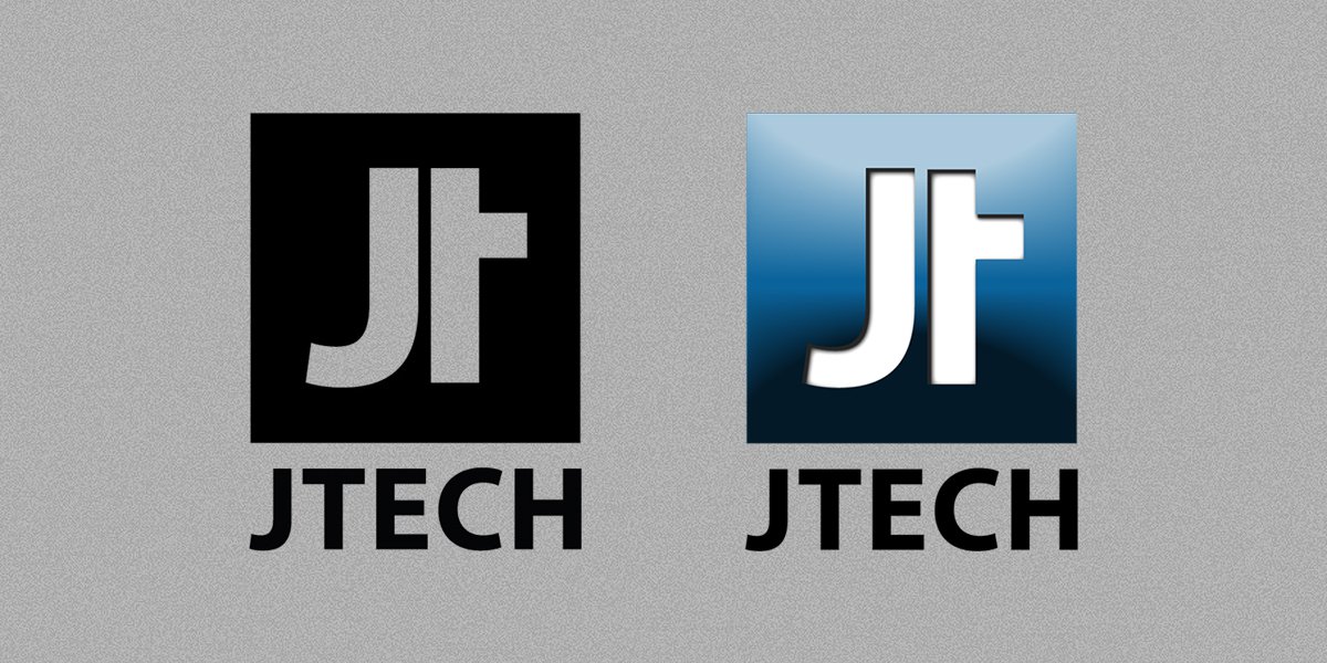 The original logo I designed for JTech in 2011.
We found an abstract permutation of "JT" that suited us — it had as much of a bold, stamp-like quality as the previous logo, but with a drastically simplified profile, one that reproduced well even at extremely small sizes. In the main color variant of the logo, we added visual touches that evoked our capacity as mobile web developers — strong gradients, embossing, and a background glow. These effects were de rigueur at the time, and although we were abandoning a strongly skeuomorphic design, the interfaces that we were designing at the time still had an overtly tactile quality.
When we redesigned our website, the two dimensionality with subtle depth of our logo became the cornerstone of an extended visual metaphor. Content and interactions on our website were presented via cards — two-dimensional objects — arranged in three-dimensional space. Navigating between pages would rearrange the cards, causing them to stack or fly or hover over other cards. When our new website launched, the rebranding was complete.
A recent history of design, in anecdotes.
In 2011, as we were reworking our logo, Apple was releasing the iPhone 4 to the world, with its "retina display" — the first time that a mass-market consumer device sported a display with pixels so dense as to be imperceptible to the viewer at ordinary viewing distance.
It's difficult to overstate how much of a galvanizing event this was for user interface design, but I'll make an attempt. As Apple and other manufacturers incorporated higher-density display technology into their phones, computers and tablets, design shifted towards emphasis on the beautiful, clean lines that could be expressed on truly high-resolution displays— particularly on typographic excellence.
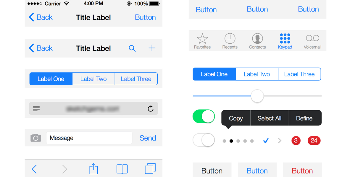 Apple's iOS 7 user interface abandoned skeuomorphism.
The glut of display densities on the market encouraged designers to use vector imagery to create crispness and consistency across platforms; vector images on the web offer poor support or no support for blurs, glows, and drop-shadows. Skeuomorphic, textural, highly tactile design gradually fell out of favor; culminating in Apple's release of iOS 7 for their mobile devices in 2013.
At the same time, responsive web design (a term coined in 2011 by Ethan Marcotte) began to gain traction as the web design strategy of the future. Responsive website designs, shapeshifting in response to the display being used, could not employ the same pixel-perfect layout methods that had been standard for fixed-frame layouts. Instead, textual content and hierarchy was being prioritized — another reason to focus design efforts on clean lines and typography.
2014: Design is subtraction.
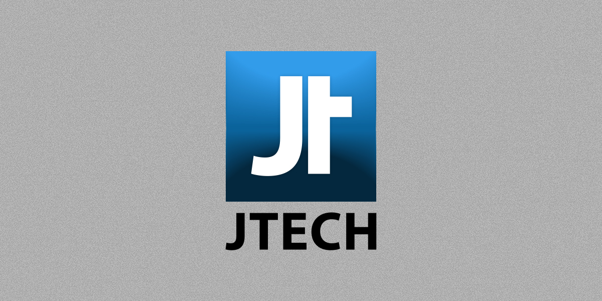 The revised version of our logo, circa 2014.
After years of research, JTech began to adopt responsive website design in 2013, fully embracing it by 2014. Like many other web design agencies, we're increasingly creating vector-first, resolution-independent iconography and visual assets. Richness in our interfaces is added via interaction — our interfaces animate in reaction to user input.
Refining our branding was a matter of bringing it in line with our current design philosophy — reducing it to the essence of what made it great. We still loved the form and shape of the logo, but found that it read more clearly without the embossing of the "JT" lettering — an increase of its affordance(1) as our brand mark. Decreasing the depth of the gradient in the logo added subtlety and emphasized on the logo's form over its ornamentation.
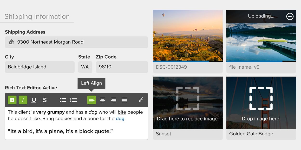 The user interface of My JTech, our management app and portal, eschews skeuomorphism and continues themes first described by the logo.
Our company's color palette has shifted with the refined logo; while the 2011 logo had a hint of turquoise in the gradient, the 2014 iteration is close to monochrome. The gradient depth and blues used in the logo lay a foundation for the color palette and styles used throughout the JTech website and My JTech, our website management app and portal. This stylistic overhaul favors clarity, minimalism and utility over glitz: color is consistently deployed to differentiate layers of data — actionable content, neutral content, active content, and negative content are all conveyed differently. Simple vector iconography further clarifies purpose. A subtractive process has been applied throughout our website interfaces, removing unnecessary stylistic conceit so that focus remains on the content that we and our clients have created.
As JTech and the meaning of advanced websites continues to evolve, our logo will surely follow, with future refinements that mirror the work we're doing. A company's logo and branding, like their website, is a living reflection of that organization's purpose. It's exciting to be working in an industry and company where change and new horizons are the status quo.
(1) Affordance is the degree to which an object suggests its purpose. A good chair is the right height and shape to sit on. A button looks like you ought to push it. A good logo clearly communicates the brand that it's representing and any visual metaphors that it is tasked with conveying.

Step 1. Taking inventory of the brand.
We took stock of what we liked about the old logo: it had a bold, stamp-like quality which gave it a strength and certainty that needed to be carried through in the rebranding. These same traits meant that it kept its visual integrity even when reduced to small sizes or given a textural treatment (as in JTech's Control Center).
On the other hand were the traits that we wanted to leave behind — for instance, the presentation of the logo as burned-in on digital parchment, matching our website's battered grimoire aesthetic. One deliberate departure we were making was away from skeuomorphism and analog metaphors in favor of a digitally native design system.

Furthermore, we were ready to be rid of the ubiquitous globe used in place of a hyphen. By this time, the globe as a shorthand for "internet company" was beyond threadbare. Further simplification was in order: removing "Communications" from the logo mark afforded a greater simplicity and allowed the logo to perform better in adverse circumstances (such as the small sizes or textured treatments mentioned above).
Step 2. New directions.
How to represent JTech's evolution? By 2011, all of the symbolic representations of website, internet, and communication had been overused to a degree that made any such iconography generic. Satellite dishes, radio towers, clouds, radio waves, and globes were no longer meaningful images for distinguishing a company's purpose — which led us away from direct metaphor and towards an abstract word or lettermark using JTECH or more simply, "JT."
The lettering is presented simply on a square, allowing clean interpretations of the branding in one-color (e.g. laserprinted) scenarios or reversed on white for use as a photographic overlay in addition to the full color variation of the logo.
Step 3. Refining the character.

We found an abstract permutation of "JT" that suited us — it had as much of a bold, stamp-like quality as the previous logo, but with a drastically simplified profile, one that reproduced well even at extremely small sizes. In the main color variant of the logo, we added visual touches that evoked our capacity as mobile web developers — strong gradients, embossing, and a background glow. These effects were de rigueur at the time, and although we were abandoning a strongly skeuomorphic design, the interfaces that we were designing at the time still had an overtly tactile quality.
When we redesigned our website, the two dimensionality with subtle depth of our logo became the cornerstone of an extended visual metaphor. Content and interactions on our website were presented via cards — two-dimensional objects — arranged in three-dimensional space. Navigating between pages would rearrange the cards, causing them to stack or fly or hover over other cards. When our new website launched, the rebranding was complete.
A recent history of design, in anecdotes.
In 2011, as we were reworking our logo, Apple was releasing the iPhone 4 to the world, with its "retina display" — the first time that a mass-market consumer device sported a display with pixels so dense as to be imperceptible to the viewer at ordinary viewing distance.
It's difficult to overstate how much of a galvanizing event this was for user interface design, but I'll make an attempt. As Apple and other manufacturers incorporated higher-density display technology into their phones, computers and tablets, design shifted towards emphasis on the beautiful, clean lines that could be expressed on truly high-resolution displays— particularly on typographic excellence.

The glut of display densities on the market encouraged designers to use vector imagery to create crispness and consistency across platforms; vector images on the web offer poor support or no support for blurs, glows, and drop-shadows. Skeuomorphic, textural, highly tactile design gradually fell out of favor; culminating in Apple's release of iOS 7 for their mobile devices in 2013.
At the same time, responsive web design (a term coined in 2011 by Ethan Marcotte) began to gain traction as the web design strategy of the future. Responsive website designs, shapeshifting in response to the display being used, could not employ the same pixel-perfect layout methods that had been standard for fixed-frame layouts. Instead, textual content and hierarchy was being prioritized — another reason to focus design efforts on clean lines and typography.
2014: Design is subtraction.

After years of research, JTech began to adopt responsive website design in 2013, fully embracing it by 2014. Like many other web design agencies, we're increasingly creating vector-first, resolution-independent iconography and visual assets. Richness in our interfaces is added via interaction — our interfaces animate in reaction to user input.
Refining our branding was a matter of bringing it in line with our current design philosophy — reducing it to the essence of what made it great. We still loved the form and shape of the logo, but found that it read more clearly without the embossing of the "JT" lettering — an increase of its affordance(1) as our brand mark. Decreasing the depth of the gradient in the logo added subtlety and emphasized on the logo's form over its ornamentation.

Our company's color palette has shifted with the refined logo; while the 2011 logo had a hint of turquoise in the gradient, the 2014 iteration is close to monochrome. The gradient depth and blues used in the logo lay a foundation for the color palette and styles used throughout the JTech website and My JTech, our website management app and portal. This stylistic overhaul favors clarity, minimalism and utility over glitz: color is consistently deployed to differentiate layers of data — actionable content, neutral content, active content, and negative content are all conveyed differently. Simple vector iconography further clarifies purpose. A subtractive process has been applied throughout our website interfaces, removing unnecessary stylistic conceit so that focus remains on the content that we and our clients have created.
As JTech and the meaning of advanced websites continues to evolve, our logo will surely follow, with future refinements that mirror the work we're doing. A company's logo and branding, like their website, is a living reflection of that organization's purpose. It's exciting to be working in an industry and company where change and new horizons are the status quo.
(1) Affordance is the degree to which an object suggests its purpose. A good chair is the right height and shape to sit on. A button looks like you ought to push it. A good logo clearly communicates the brand that it's representing and any visual metaphors that it is tasked with conveying.

