
Logo Design for Green Thumb Organics
Project Overview
Logo Design Digging Deep Into Symbolism
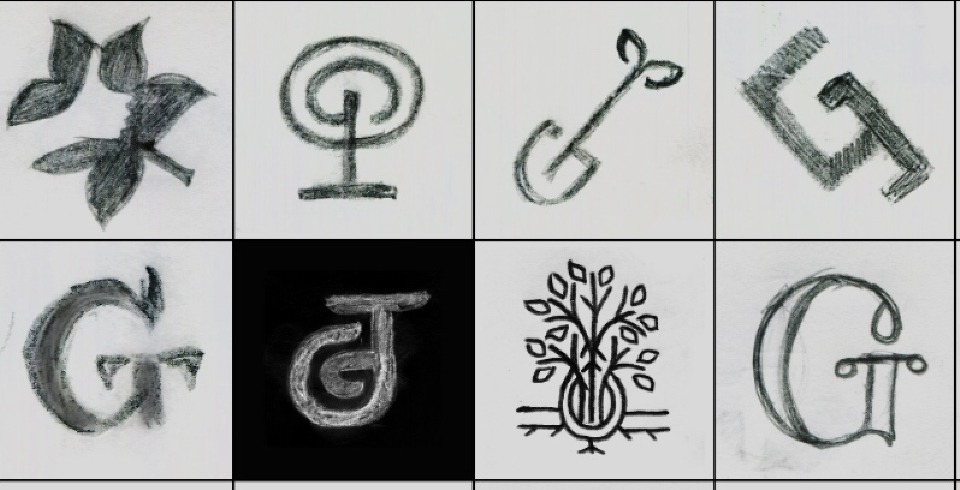
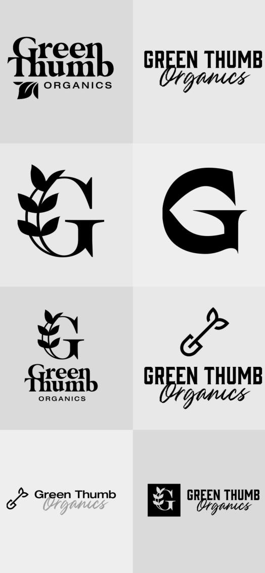
Our logo design team worked with Green Thumb Organics during their rebrand to create a logo that seamlessly combined the natural and practical aspects of their business. The first step in great design for branding? A logo that perfectly encapsulates their services and message.
Green Thumb Organics is a nursery located in Belgrade, MT.
What We Did

What We Did
The shovel that features prominently in the Green Thumb Organics logo digs into the fertile offerings we wanted to highlight for their Billings consumer base.
A shovel is a gardener's favorite tool. A shovel also allows us to emphasize our main points. Its hard angles and organic curves perfectly represent the balance between chaotic natural growth and guided production that gardeners strive to master.
The juxtaposition of hard and soft we created in the logo's stylized shovel is echoed in the clean, graceful curves that make up the seedling and in the font in the rest of Green Thumb Organic's logo.

Success
Green Thumb Organics' new logo will serve their well-regarded garden supply store well.
Green Thumb Organics' logo succeeds as a unique mark through its interconnected figures. The spade, the seedling, and the font flow from one element to the next without pause. Their new brand speaks to growth for their customers and their business in an inviting and memorable way.
