
Everyone scrolls: designing below the fold.
If you're a designer or work with designers, you're certainly familiar with the concept of designing "above the fold." This is a design philosophy that originates in newspapers, where the upper half of the front page is loaded with the most important stories and photographs, as well as the prime advertising space. Above the fold information is what's first presented to the viewer, and it has been extended as a concept from the world of newspapers and print design to the world of web design.

Even within the realm of web design, presenting all important information and navigation "above the fold" — without requiring the user to scroll —has been passed around as gospel. This dates back to the early years: when the internet was brand new to its users, many people didn't scroll at all.
Is the fold still relevant in 2014?
According to a 2007 study by Clicktale, 76% of visits to pages with scrollbars scrolled down. This is conclusive evidence that users do scroll — but what does that mean for our page layouts? This was revisited in Nielsen Norman Group's 2015 study (1).
Most user time and attention is still spent at the top of the page: to be specific, 80% of user viewing time is still above the fold (2). User attention is at its height when visitors first arrive on the page, with a focused drive for relevant information. This gradually decreases as they quickly scan through the rest of the page, until they reach the bottom, where they focus a bit more attention (if they make it that far).
Jakob Nielsen describes this phenomenon:
"It's as if users arrive at a page with a certain amount of fuel in their tanks. As they "drive" down the page, they use up gas, and sooner or later they run dry. The amount of gas in the tank will vary, depending on each user's inherent motivation and interest in each page's specific topic. Also, the "gasoline" might evaporate or be topped up if content down the page is less or more relevant than the user expected."
Guiding the user.
The "emptying gas tank" phenomenon can be mitigated somewhat by designing a clear hierarchy and trail of information, with the top of the page used to introduce the point of the page — the product, service, or subject being explored. From this jumping off point, it's useful to introduce visual cues, which range from the subtle to the blatant.
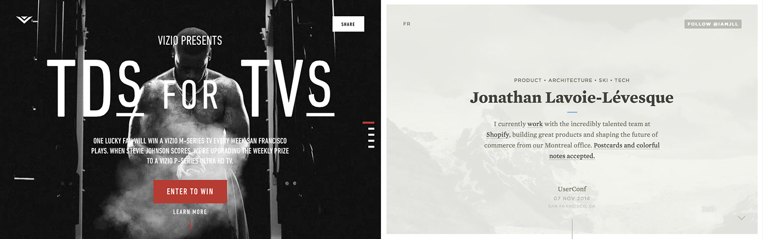 Shown above: in the example at left, text reading "Learn More" with an arrow pointing downwards encourages scrolling. In the example on the right, a line leads down the page to the rest of the timeline.
A simple approach is to design your content that it spans the fold and appears incomplete or cut off at the bottom of the window, suggesting that there's probably more to see below. Be wary of horizontal bands of empty content that span the page — they can easily be mistaken for the page's end.
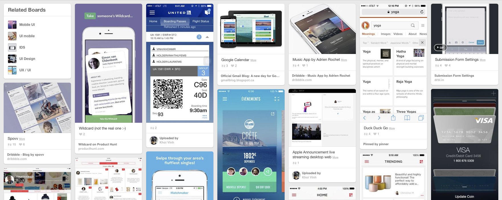 Pinterest offers "cards" of information in staggered columns, which makes it obvious that there's always more content to see if you scroll down.
Less subtle approaches involve visual connections from one element to another — arrows pointing down the page at the next stage in a process, or a visual trail that leads visitors through the story being told by the page. Most obvious of all is a big button with text: "Scroll down for more!"
Responsive design and the fold.
"Above the fold" used to be a fixed dimension — the top 600 pixels or so of a website were guaranteed to be visible to the vast majority of visitors. In today's world of phones and tablets and massive desktop monitors, there is no longer a reliable "fold" to design for. Today's screen variance — and especially the reintroduction of small screens — means that we must focus on organizing and content into logical hierarchical groups.
Using the strategies shown above — deliberately cutting off content, visual trails and scroll buttons — will all help encourage mobile users to scroll. Even if we wanted to, there simply isn't enough room to cram all the important information above the fold on mobile screens. However, there's evidence that certain content should live below the fold anyway.
What content should live below the fold?
Web landing pages focused on selling a product or service are a valuable example of how to organize content on a webpage. The traditional, conventional advice is to provide a prominent call to action above the fold: "Buy Now," "Get Started," "Get It Free," and so on.
However, in cases where building trust or persuading a potential buyer is a necessary part of the pitch, it may be better for your call-to-actions to appear lower on the page, after evidence, testimonials, or other trust-building material has been presented. If you're selling insurance or medical services, a below-the-fold call to action could be advisable. Even when building trust, however, it’s important to present the essence of your topic above the fold.
Conclusions
There is inarguably value in presenting important information up front. Visitors to your website immediately begin making decisions about whether you're trustworthy or offering something that they're interested in. If the first impression is positive, you can focus their attention through well-organized content that flows strongly from one section to the next.
However, visitors to your website will scroll. The more relevant and well-written the content, and the better the organization, the more they will scroll. If your website is a novel, the space above the fold can function as your book's cover and introduction — no need to try fitting the whole story on the first page. Because mobile devices have all-but-guaranteed that some of your visitors will have to scroll, it makes more sense to focus on establishing the story and getting your visitors' interest.
Citations:
(1) Nielsen Norman Group: The Fold Manifesto
(2) Nielsen Norman Group: Scrolling and Attention
(3) Conversation Rate Experts: Crazy Egg Case Study
Even within the realm of web design, presenting all important information and navigation "above the fold" — without requiring the user to scroll —has been passed around as gospel. This dates back to the early years: when the internet was brand new to its users, many people didn't scroll at all.
Is the fold still relevant in 2014?
According to a 2007 study by Clicktale, 76% of visits to pages with scrollbars scrolled down. This is conclusive evidence that users do scroll — but what does that mean for our page layouts? This was revisited in Nielsen Norman Group's 2015 study (1).
Most user time and attention is still spent at the top of the page: to be specific, 80% of user viewing time is still above the fold (2). User attention is at its height when visitors first arrive on the page, with a focused drive for relevant information. This gradually decreases as they quickly scan through the rest of the page, until they reach the bottom, where they focus a bit more attention (if they make it that far).
Jakob Nielsen describes this phenomenon:
"It's as if users arrive at a page with a certain amount of fuel in their tanks. As they "drive" down the page, they use up gas, and sooner or later they run dry. The amount of gas in the tank will vary, depending on each user's inherent motivation and interest in each page's specific topic. Also, the "gasoline" might evaporate or be topped up if content down the page is less or more relevant than the user expected."
Guiding the user.
The "emptying gas tank" phenomenon can be mitigated somewhat by designing a clear hierarchy and trail of information, with the top of the page used to introduce the point of the page — the product, service, or subject being explored. From this jumping off point, it's useful to introduce visual cues, which range from the subtle to the blatant.
A simple approach is to design your content that it spans the fold and appears incomplete or cut off at the bottom of the window, suggesting that there's probably more to see below. Be wary of horizontal bands of empty content that span the page — they can easily be mistaken for the page's end.
Less subtle approaches involve visual connections from one element to another — arrows pointing down the page at the next stage in a process, or a visual trail that leads visitors through the story being told by the page. Most obvious of all is a big button with text: "Scroll down for more!"
Responsive design and the fold.
"Above the fold" used to be a fixed dimension — the top 600 pixels or so of a website were guaranteed to be visible to the vast majority of visitors. In today's world of phones and tablets and massive desktop monitors, there is no longer a reliable "fold" to design for. Today's screen variance — and especially the reintroduction of small screens — means that we must focus on organizing and content into logical hierarchical groups.
Using the strategies shown above — deliberately cutting off content, visual trails and scroll buttons — will all help encourage mobile users to scroll. Even if we wanted to, there simply isn't enough room to cram all the important information above the fold on mobile screens. However, there's evidence that certain content should live below the fold anyway.
What content should live below the fold?
Web landing pages focused on selling a product or service are a valuable example of how to organize content on a webpage. The traditional, conventional advice is to provide a prominent call to action above the fold: "Buy Now," "Get Started," "Get It Free," and so on.
However, in cases where building trust or persuading a potential buyer is a necessary part of the pitch, it may be better for your call-to-actions to appear lower on the page, after evidence, testimonials, or other trust-building material has been presented. If you're selling insurance or medical services, a below-the-fold call to action could be advisable. Even when building trust, however, it’s important to present the essence of your topic above the fold.
Conclusions
There is inarguably value in presenting important information up front. Visitors to your website immediately begin making decisions about whether you're trustworthy or offering something that they're interested in. If the first impression is positive, you can focus their attention through well-organized content that flows strongly from one section to the next.
However, visitors to your website will scroll. The more relevant and well-written the content, and the better the organization, the more they will scroll. If your website is a novel, the space above the fold can function as your book's cover and introduction — no need to try fitting the whole story on the first page. Because mobile devices have all-but-guaranteed that some of your visitors will have to scroll, it makes more sense to focus on establishing the story and getting your visitors' interest.
Citations:
(1) Nielsen Norman Group: The Fold Manifesto
(2) Nielsen Norman Group: Scrolling and Attention
(3) Conversation Rate Experts: Crazy Egg Case Study

About Felix Wolfstrom
Felix Wolfstrom has 13+ years of experience in human interface design. He currently serves as JTech’s Senior Designer. Felix’s experienced approach to web design guides every website JTech creates. He focuses on usable, meaningful design that doesn’t compromise on aesthetic value.
More articles by Felix: Dark Patterns in Design | 17 UI Tips for Designing Mobile-Friendly Websites | JTech Brand Evolution