Do you ever wonder how website designers choose colors for their projects? There's a lot of strategy and consumer behavior research that goes into the colors on websites. Typically the color scheme is directly associated with the emotions they are trying to impress upon their users. Here are a few examples --
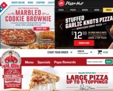
Red is an all-out attention getter, can have a physical effect on people and has been known to increase metabolism
(1). Could this be why so many pizza websites prominently display this color in their design? In some studies red has also caused people to become more responsive to quick decision-making, eliminating the period of time they spend analyzing whether or not they should buy something
(2). Notice how Dominoes and Pizza Hut have employed this with their “Order Now” button, enticing the user to get a pizza. You can almost smell the conversions.
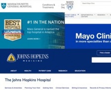
Blue is the most widely-accepted color overall. It is associated with tranquility, peace, and similar soothing feelings. It is no wonder then, that some of the most notable hospitals in the country use them in their branding. Hospitals want to display a trusting, caring and peaceful format on their website.
Green has the repute of being environmentally friendly. It is often associated with organic foods, sustainable practices and an overall natural vibe. Is it no surprise then, that some well known oil and energy corporations have green themes, nudging those that interact with their brand to see them in an environmentally oriented light?
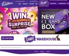
Violet is the color of royalty and is often found on websites that are offering products of indulgence or wealth. Some real estate companies use it to convey a premium product and banks have been known to integrate it into their brand as well. Crown Royal uses violet hues to elevate their bottles to a higher shelf. Why not candy? A violet theme on Cadbury’s website gives the user a sense of quality and extravagance.
Not every website follows these subliminal nudges, however many of them have put a lot of time and research into making sure their branding is consistent with the company’s messages. There are countless other examples of websites employing color psychology to help supplement their branding. To name a couple examples from our work, We gave
Bank of Bozeman the cool, friendly feel of blue, and
Clark Film Buying hues of orange to make it enticing and exciting. The goal is to find the point where intelligent design meets aesthetic branding. The colors of your website will have an effect on the way your users interact with your brand. Choose wisely.
Sources
(1) Smashing Magazine
(2) Forbes
