
Responsive Design
A brave new world.
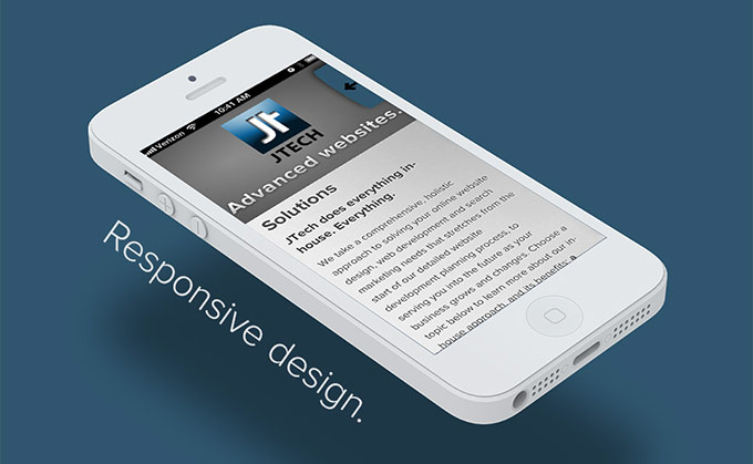
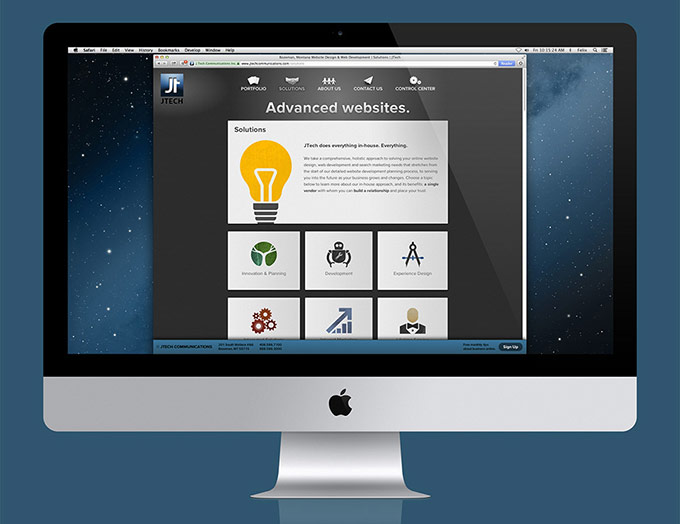
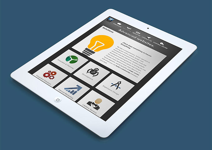
We’ve just put the finishing touches on a new iteration of the JTech Communications website. This complete overhaul adds several new features and uses responsive design: depending on the screen size of the device being used to view it, the layout will shift and flow so that it’s legible, beautiful and well-optimized — no panning or zooming required. If you’re using a computer to read this, try navigating to our website and resizing your browser window to see the responsive layout in action.
Say less, show more.
Our new homepage offers a unique fly-through view of our portfolio — a distinctive flourish that we haven’t seen anywhere else on the web. Our team created clean, warm illustrations that begin to define a language characterizing our services and approach. We’ve added small touches throughout the site to increase its degree of interactivity: when transitioning between pages, cards slide in one at a time; when closing the detailed view of an article or biography, a subtle spinning animation gives feedback that your cursor is in the right place. Interaction also means creating a dialogue with our customers and peers — an effort we started through the JTech Dispatch and Weekly Announcements.
Creating a conversation about modern web design.
The site adds a technical blog, where we’ll share challenges, solutions, and perspectives about modern web development. We expect to post every month or so, sharing all our team members’ perspectives about what makes the work interesting, the challenges we face, and the ever changing industry in which we work.
We’ve also integrated social media hooks into the periodic aspects of our website. In recent months, we’ve opened Facebook, LinkedIn and Google+ pages where we share our latest announcements and connect with customers and peers. We’re charting a new path into the social side of the web, and we hope to cross paths with you there.
To the future!
Our new website is an exciting leap into the future of web design. From the responsive web design to the fluid animations and immersive, visual approach, we see this as a beneficial path for anyone doing business on the web. If you have questions about responsive web design or modern web development for your website, contact us today – we’d love to hear from you.

We’ve just put the finishing touches on a new iteration of the JTech Communications website. This complete overhaul adds several new features and uses responsive design: depending on the screen size of the device being used to view it, the layout will shift and flow so that it’s legible, beautiful and well-optimized — no panning or zooming required. If you’re using a computer to read this, try navigating to our website and resizing your browser window to see the responsive layout in action.
Say less, show more.
Our new homepage offers a unique fly-through view of our portfolio — a distinctive flourish that we haven’t seen anywhere else on the web. Our team created clean, warm illustrations that begin to define a language characterizing our services and approach. We’ve added small touches throughout the site to increase its degree of interactivity: when transitioning between pages, cards slide in one at a time; when closing the detailed view of an article or biography, a subtle spinning animation gives feedback that your cursor is in the right place. Interaction also means creating a dialogue with our customers and peers — an effort we started through the JTech Dispatch and Weekly Announcements.

Creating a conversation about modern web design.
The site adds a technical blog, where we’ll share challenges, solutions, and perspectives about modern web development. We expect to post every month or so, sharing all our team members’ perspectives about what makes the work interesting, the challenges we face, and the ever changing industry in which we work.
We’ve also integrated social media hooks into the periodic aspects of our website. In recent months, we’ve opened Facebook, LinkedIn and Google+ pages where we share our latest announcements and connect with customers and peers. We’re charting a new path into the social side of the web, and we hope to cross paths with you there.

To the future!
Our new website is an exciting leap into the future of web design. From the responsive web design to the fluid animations and immersive, visual approach, we see this as a beneficial path for anyone doing business on the web. If you have questions about responsive web design or modern web development for your website, contact us today – we’d love to hear from you.

