
Logo Design for Pirenzia
Project Overview
A Modern Solution for Age Old Problems
Pirenzia hired our design team to create a logo that would allow them to boldly enter the pharmaceutical market with their exciting new vaccines. While their initial target market is rooted firmly in the realm of agriculture, Pirenzia wants to eventually produce human vaccinations.
Correspondingly,
they needed a logo that could tell the same story of reliability and trustworthiness in either market.

What We Did


What We Did
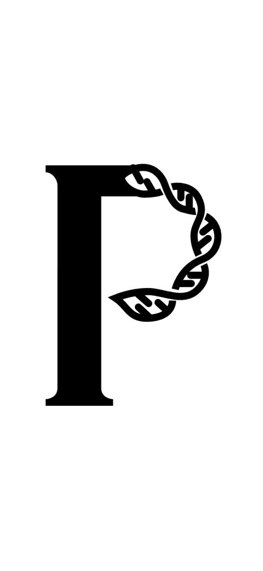
Focusing on DNA shuffling also allowed us to harness history for Pirenzia's benefit—the discovery of DNA is one of the most historic landmarks in modern medical history. Additionally, the use of DNA within logos and website designs has become commonly recognized as shorthand for scientific integrity.
With our approach to their business's branding, Pirenzia can take a visual stance rooted in science while maintaining an air of approachability.


Success
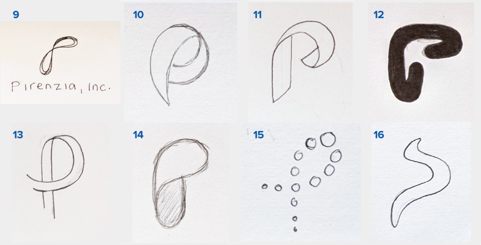
We created Pirenzia a logo crafted from a minimalistic and blocky ribbon of DNA shuffled to resemble a stylized 'P.' Our novel take on a familiar design concept lends Pirenzia a trustworthy and innovative spirit.
The Pirenzia logo balances between geometric abstraction and literalist design clues about their DNA shuffling specialty—staking a claim in the medical community.
The Pirenzia logo balances between geometric abstraction and literalist design clues about their DNA shuffling specialty—staking a claim in the medical community.
