Using Adobe After Effects to Design and Prototype 3D CSS Animations: Part I
Summary
Adobe After Effects can be an extremely useful prototyping tool for mocking up 3D CSS transforms and animations, and even 2D CSS transforms and animations. Prototyping CSS transforms and animations in After Effects can produce realistic results, and even animation properties can be translated into CSS values. Programming resources are usually limited, so experimenting with various effects in CSS can prove invaluable, and coming to your development team with a polished prototype transform or animation can help the programmer focus on implementation rather than creation.
An introduction: Project Manager and wearer of hats.
JTech Communications out of Bozeman, Montana hired me earlier this year — and I have to say that I have discovered the perfect fit for my love of web development and passion for designing custom websites. Although I am the Project Manager, I wear many hats. In fact, I have come to learn that being part of a growing web development company involves constant change. I am always looking at ways to improve our workflow or internal operations — while staying up to date with current web standards. Because my job is multifaceted, I will be writing future blog posts on any number of advanced website subjects — technical tidbits, client relations, or design perspectives informed by my own grounding and history as a photographer in Montana and around the world.
Rebuilding our Website.
A few months ago, our custom web design team began making a wish list of features for a refresh to our website. When we decided it was time to build our wish list, the depth of the changes led to rebuilding the website from the ground up to add responsive design, use the latest standards, utilize the newest version of our custom framework, incorporate new content such as this blog, and take our CSS3 animations to the next level.
When we started talking about CSS3 animations, the first order of business was our home page image rotator. The previous rendition of our site already used 3D transforms for an image carousel, but we wanted to come up with something new and innovative. Image rotators have been around for a long time, and there are tons of javascript sliders and rotators that come packaged with a seemingly-endless set of transition effects. The few image rotators that diverge from the usual 2D transitions and hackneyed 3D animations tend to enter the realm of gimmicky transitions, poor performance issues, or both. Our goal was to develop a unique image rotator based on a 3D CSS animation that avoided gimmickry and tackiness while overcoming potential performance issues and browser compatibility. It turned out to be a rewarding adventure in the third dimension — and we learned a lot.
Creating a digital world.
We decided to create a 3D world of portfolio pieces (from now on referred to as objects) in which the user (the camera) would fly to each object. The focus would cycle through our six of our eighteen most recent projects, showcasing each in turn. Since we were working within a 3D world, I wanted to take advantage of the opportunity to utilize depth of field in the design. A few years back I asked myself: why don’t designers utilize depth of field often (if at all)? The thought of using depth of field to define usability and focus in an interface was exciting. For our project, depth of field would be based on an object’s location in 3D space — calculated dynamically with the CSS blur filter.
Creating a 3D world provided many new possibilities, as well as raising many questions that we had to answer to move forward. We began evaluating these questions before we embarked on the project. Would camera orientation change along a given path? What were the most appealing blur levels?, What was the appropriate perspective, and how many objects will there be? Would the camera’s paths be static and determined before hand, or dynamic and random? Which possible paths are visually interesting? Of the possible paths, which perform best? How will we iterate our 18 most recent portfolio pieces throughout the field of objects? How many objects could browsers (and devices) handle in a given view?
Creating the Mockup
To begin answering these questions, we had to create the world — without code. We had to be sure we liked the way our world looked, and did not want to waste our programming team’s time on something we weren’t certain we liked. After Effects is a powerful tool, and even those without any experience in After Effects can gain enough of a foundation to mockup most 3D Transform animations after watching a few tutorials over the course of 1-3 hours. After Effects provides efficient means through which you can place objects in space based on X, Y, and Z coordinates; by using a camera layer in that 3D space, the world becomes easy to navigate. Paths and key frames are inherent in After Effects, which made it easy to create the fly-to animations along a path.
Before we even began a composition in After Effects, we sketched out our world on paper to provide some direction before composing in After Effects. We wanted to draw out where our 6 pieces could be in order to generate an interesting path. We knew we wanted to cycle through 6 of our 18 most recent portfolio pieces, and then repeat, which meant the end had to connect to the beginning. (We also planned on adding more dummy objects in order to fill out the world to create a better effect.) This meant the user would go in a circle, with a goal of obscuring that loop in the path. To increase variation in the path, we decided to make 18 objects, iterating each of the 6 pieces three times. Once we had a mockup of our field, we started drawing lines from piece to piece and numbering them 1-6 to make sure there wasn’t any possibility of seeing the same piece in juxtaposition with its clone. This meant if we were looking at Object 1, the other two Object 1’s had to be far enough away that you wouldn’t see them behind or next to the Object 1 you were currently focused on. (See Fig. 1, 2) Next, we had to make sure that every 6 was able to hook back up with a 1 so that we could loop through the three paths. We decided that any 6 had avoid being in a position where the 1 was really far away. We got to a point that we felt we had a good plan. After our sketching exercise, it was time to take the paper mockup and re-create something similar in After Effects.
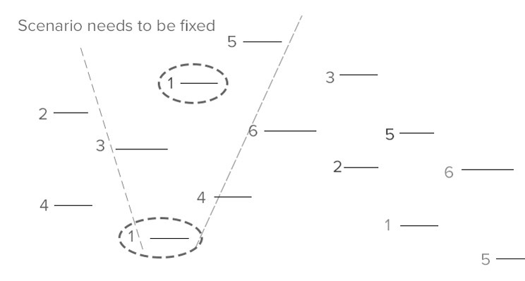
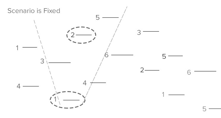
Fig. 1 - The example illustrated above is to demonstrate what we were trying to avoid. On paper, we would kind of guess a field of view, something that I could modify if I had to in case we ran into situations where the field of view was so wide that it was impossible to avoid this situation. We rearranged the numbers until you could never see the same number twice in any given field of view when you were focused on the object.
Creating the World in After Effects
I began with a composition that approximated a large browser window — just so I had a realistic idea of what the final result would look like. I added in some of our website’s static interface elements on their own layers, and was left with the empty space in which to create the world. One important note: I left the static interface elements as 2D layers, while manipulating all the portfolio objects in 3D. Leaving the static interface in 2D preserved its position regardless of where the camera traveled through the world. (See Fig. 3)
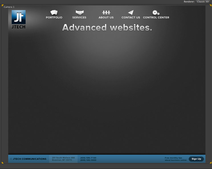
Fig. 3 - The navigation elements, our logo, and our footer were going to be on top of the objects at all times. I left these as 2D layers and then was able to create the 3D world that would appear behind these important UI elements.
My first goal was to place 18 objects that varied on the X, Y, and Z axes, placed similarly to our paper mockup. One thing our map did not illustrate was any change on the Y axis. I played around with moving objects up and down on the Y axis, as well as moving them on the X and Z. Eventually I had 18 objects that were positioned in a way that seemed appropriate. Following that, it was time to create the camera that would allow me to fly around in the space. Until I had a camera I wouldn’t know if my positions were ideal. (The first time around I did end up placing objects too close to one another).
My second goal was to determine the 3D camera settings in order to flesh out relative size between the objects in the world. This would also affect the object positions - the distances between objects needed to generate interesting paths. I needed to determine an ideal speed, and if it took too long or too short to get to the next object, the animation felt wrong. It would also determine the distance my null object would be from the objects (more on this in the next section). The reason to define the camera settings after placing objects is because the various camera properties that After Effects provides, such as zoom, will modify the relative distance and size between objects — as well as their relative position from the camera’s point of view (AKA perspective — which is what the browser window will show). Changing this property on the camera isn’t quite as useful or intuitive without objects to look at. Theoretically I could have created identical results even if my camera settings were different, just by using larger or smaller objects. Because my objects were 900x700 pixels my camera settings would be specified to make a world of objects that big look good. In After Effects, the camera’s zoom and focus distance is typically set to be the same value. Allow me to clarify the difference between these properties and why I set them to be the same. Zoom is distance between the lens and the image plane. The image plane is where an object would appear at full size. (AE has cleverly calculated how a 50mm lens would behave in terms of pixels, but more on that another day). The Focus Distance property is the distance from the lens to the plane where objects appear in perfect focus (which can be different than the zoom distance!) For most purposes, you want those to be the same — in my case, I definitely want the zoom plane to match the focal plane. (See Fig. 4, 5)


Fig. 4, 5 - As you can see, the relative size of the focused object is the same, but the objects around it appear as relatively different distances and sizes. The only properties that are different are the Zoom/Focus Distance properties. The camera is placed 400px closer to maintain the relative size of the object that is being focused on - which is simply because we changed the zoom from 800 to 400 = 400. When you Zoom out, objects appear further away, farther apart from each other, and of course, smaller. In the second image you can see that the zoom has been increased, which we decided was the more interesting of the two. We used a Zoom/Focus Distance of 800px.
Creating the Animation in After Effects
Now, with the camera settings mostly setup (I used a depth of field that blurred objects enough that they didn’t distract from the object that was being focused on) I wanted to make camera positioning easy, so I created a null object. There are lots of good tutorials on the uses of null objects, so I will only go into it briefly. A null object is an invisible point in space, often used for positioning layers in a parent>child layer relationship. I aligned the null object on the same plane as the focus distance/zoom of the camera. In other words, the invisible plane that my camera was zoomed into and focused on also was the same plane that my null object was on. I also made the null object a parent to the camera, so that any movement of the null object would also move the camera accordingly. This set up made things a lot easier, because then I just had to position the null object using the same exact coordinates as an object I wanted to focus on, instead of doing a bunch of math to calculate where the camera had to be placed so that the focus distance and zoom landed on the object’s position. (See Fig. 6, 7)
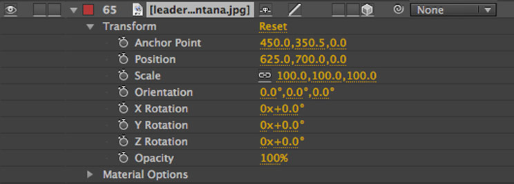
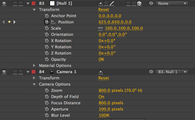
Fig. 6,7 - The Leadership Montana object’s coordinates were used to place the null object on the same plane as the object - which also is the same plane as the camera’s zoom and focus distance - resulting in perfect positioning of the camera. I could then animate the null object and the camera would just follow. Important note: In my application, the object appeared too high, because of my 2d interface. The objects appear centered on the composition, not my interface. In order to correct this, I calculated how many pixels down the object would have to move in order for it to appear as it would in the browser, below the heading “Advanced Websites”. That value turned out to be 50px, which is why there is a 50px discrepancy in my Y position between the null object and the portfolio object.
I just had to copy and paste coordinates from the object I wanted to focus on into the null object’s coordinates and my camera would immediately be placed right in front of the object I wanted to focus on, at the exact distance it needed to be from the object. Lastly, the other important reason to use the null object was because our final product was going to be built with CSS, which had to use the positions of the pieces — there is no concept of a camera in CSS 3D Transforms. In CSS 3D Transforms, objects and space are flying around you, rather than you flying through space. It’s all object coordinate-based. By positioning the null object exactly with the objects, I knew I could provide some kind of information to our programmer. I would space my keyframes out two seconds because the timing could be changed in CSS. I did not worry about the “pausing” part. Each keyframe was created for my null object (which moves the camera), and afterwards I added animations between keyframes. (See Fig. 8)

Fig. 8 - It was easy to create all 18 keyframes fairly quickly, because I just had to move my current time indicator 2 seconds, copy the position of the destination portfolio piece from the last, and then paste them into my null object’s position coordinates.
The path was crude, because it was just a straight line by default. In order to make it look more interesting, I modified the path using the pen tool and the top and right views of my world, modifying the red path line manually. (See Fig. 9)
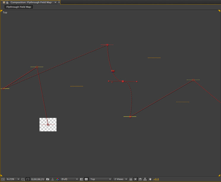
Fig. 9 - The red path appears based on your position on the timeline - and it only shows so many keyframes. The number of frames you can see at one time is editable in the preferences dialogue. In order to modify the red path, its helpful to use the top view, or the right view, to maintain explicit access to either the Y axis, or the X and Z axis. With the pen tool selected, you can treat the read path just as you would a bezier curve. That way, the camera can travel on a path that may flow around objects, instead of straight line.
I knew that our web development team would do a slightly different animation so I didn’t spend too much time making it perfect. I did add some easing, so you slowed down as you approached the object to be focused on, and then slowly sped up to full speed when you left a piece. Our team found my proof of concept in After Effects appealing, so we decided to take the time to do a proof of concept in CSS and Javascript to evaluate browser performance.
To be continued in Part II.
Adobe After Effects can be an extremely useful prototyping tool for mocking up 3D CSS transforms and animations, and even 2D CSS transforms and animations. Prototyping CSS transforms and animations in After Effects can produce realistic results, and even animation properties can be translated into CSS values. Programming resources are usually limited, so experimenting with various effects in CSS can prove invaluable, and coming to your development team with a polished prototype transform or animation can help the programmer focus on implementation rather than creation.
An introduction: Project Manager and wearer of hats.
JTech Communications out of Bozeman, Montana hired me earlier this year — and I have to say that I have discovered the perfect fit for my love of web development and passion for designing custom websites. Although I am the Project Manager, I wear many hats. In fact, I have come to learn that being part of a growing web development company involves constant change. I am always looking at ways to improve our workflow or internal operations — while staying up to date with current web standards. Because my job is multifaceted, I will be writing future blog posts on any number of advanced website subjects — technical tidbits, client relations, or design perspectives informed by my own grounding and history as a photographer in Montana and around the world.
Rebuilding our Website.
A few months ago, our custom web design team began making a wish list of features for a refresh to our website. When we decided it was time to build our wish list, the depth of the changes led to rebuilding the website from the ground up to add responsive design, use the latest standards, utilize the newest version of our custom framework, incorporate new content such as this blog, and take our CSS3 animations to the next level.
When we started talking about CSS3 animations, the first order of business was our home page image rotator. The previous rendition of our site already used 3D transforms for an image carousel, but we wanted to come up with something new and innovative. Image rotators have been around for a long time, and there are tons of javascript sliders and rotators that come packaged with a seemingly-endless set of transition effects. The few image rotators that diverge from the usual 2D transitions and hackneyed 3D animations tend to enter the realm of gimmicky transitions, poor performance issues, or both. Our goal was to develop a unique image rotator based on a 3D CSS animation that avoided gimmickry and tackiness while overcoming potential performance issues and browser compatibility. It turned out to be a rewarding adventure in the third dimension — and we learned a lot.
Creating a digital world.
We decided to create a 3D world of portfolio pieces (from now on referred to as objects) in which the user (the camera) would fly to each object. The focus would cycle through our six of our eighteen most recent projects, showcasing each in turn. Since we were working within a 3D world, I wanted to take advantage of the opportunity to utilize depth of field in the design. A few years back I asked myself: why don’t designers utilize depth of field often (if at all)? The thought of using depth of field to define usability and focus in an interface was exciting. For our project, depth of field would be based on an object’s location in 3D space — calculated dynamically with the CSS blur filter.
Creating a 3D world provided many new possibilities, as well as raising many questions that we had to answer to move forward. We began evaluating these questions before we embarked on the project. Would camera orientation change along a given path? What were the most appealing blur levels?, What was the appropriate perspective, and how many objects will there be? Would the camera’s paths be static and determined before hand, or dynamic and random? Which possible paths are visually interesting? Of the possible paths, which perform best? How will we iterate our 18 most recent portfolio pieces throughout the field of objects? How many objects could browsers (and devices) handle in a given view?
Creating the Mockup
To begin answering these questions, we had to create the world — without code. We had to be sure we liked the way our world looked, and did not want to waste our programming team’s time on something we weren’t certain we liked. After Effects is a powerful tool, and even those without any experience in After Effects can gain enough of a foundation to mockup most 3D Transform animations after watching a few tutorials over the course of 1-3 hours. After Effects provides efficient means through which you can place objects in space based on X, Y, and Z coordinates; by using a camera layer in that 3D space, the world becomes easy to navigate. Paths and key frames are inherent in After Effects, which made it easy to create the fly-to animations along a path.
Before we even began a composition in After Effects, we sketched out our world on paper to provide some direction before composing in After Effects. We wanted to draw out where our 6 pieces could be in order to generate an interesting path. We knew we wanted to cycle through 6 of our 18 most recent portfolio pieces, and then repeat, which meant the end had to connect to the beginning. (We also planned on adding more dummy objects in order to fill out the world to create a better effect.) This meant the user would go in a circle, with a goal of obscuring that loop in the path. To increase variation in the path, we decided to make 18 objects, iterating each of the 6 pieces three times. Once we had a mockup of our field, we started drawing lines from piece to piece and numbering them 1-6 to make sure there wasn’t any possibility of seeing the same piece in juxtaposition with its clone. This meant if we were looking at Object 1, the other two Object 1’s had to be far enough away that you wouldn’t see them behind or next to the Object 1 you were currently focused on. (See Fig. 1, 2) Next, we had to make sure that every 6 was able to hook back up with a 1 so that we could loop through the three paths. We decided that any 6 had avoid being in a position where the 1 was really far away. We got to a point that we felt we had a good plan. After our sketching exercise, it was time to take the paper mockup and re-create something similar in After Effects.


Fig. 1 - The example illustrated above is to demonstrate what we were trying to avoid. On paper, we would kind of guess a field of view, something that I could modify if I had to in case we ran into situations where the field of view was so wide that it was impossible to avoid this situation. We rearranged the numbers until you could never see the same number twice in any given field of view when you were focused on the object.
Creating the World in After Effects
I began with a composition that approximated a large browser window — just so I had a realistic idea of what the final result would look like. I added in some of our website’s static interface elements on their own layers, and was left with the empty space in which to create the world. One important note: I left the static interface elements as 2D layers, while manipulating all the portfolio objects in 3D. Leaving the static interface in 2D preserved its position regardless of where the camera traveled through the world. (See Fig. 3)

Fig. 3 - The navigation elements, our logo, and our footer were going to be on top of the objects at all times. I left these as 2D layers and then was able to create the 3D world that would appear behind these important UI elements.
My first goal was to place 18 objects that varied on the X, Y, and Z axes, placed similarly to our paper mockup. One thing our map did not illustrate was any change on the Y axis. I played around with moving objects up and down on the Y axis, as well as moving them on the X and Z. Eventually I had 18 objects that were positioned in a way that seemed appropriate. Following that, it was time to create the camera that would allow me to fly around in the space. Until I had a camera I wouldn’t know if my positions were ideal. (The first time around I did end up placing objects too close to one another).
My second goal was to determine the 3D camera settings in order to flesh out relative size between the objects in the world. This would also affect the object positions - the distances between objects needed to generate interesting paths. I needed to determine an ideal speed, and if it took too long or too short to get to the next object, the animation felt wrong. It would also determine the distance my null object would be from the objects (more on this in the next section). The reason to define the camera settings after placing objects is because the various camera properties that After Effects provides, such as zoom, will modify the relative distance and size between objects — as well as their relative position from the camera’s point of view (AKA perspective — which is what the browser window will show). Changing this property on the camera isn’t quite as useful or intuitive without objects to look at. Theoretically I could have created identical results even if my camera settings were different, just by using larger or smaller objects. Because my objects were 900x700 pixels my camera settings would be specified to make a world of objects that big look good. In After Effects, the camera’s zoom and focus distance is typically set to be the same value. Allow me to clarify the difference between these properties and why I set them to be the same. Zoom is distance between the lens and the image plane. The image plane is where an object would appear at full size. (AE has cleverly calculated how a 50mm lens would behave in terms of pixels, but more on that another day). The Focus Distance property is the distance from the lens to the plane where objects appear in perfect focus (which can be different than the zoom distance!) For most purposes, you want those to be the same — in my case, I definitely want the zoom plane to match the focal plane. (See Fig. 4, 5)


Fig. 4, 5 - As you can see, the relative size of the focused object is the same, but the objects around it appear as relatively different distances and sizes. The only properties that are different are the Zoom/Focus Distance properties. The camera is placed 400px closer to maintain the relative size of the object that is being focused on - which is simply because we changed the zoom from 800 to 400 = 400. When you Zoom out, objects appear further away, farther apart from each other, and of course, smaller. In the second image you can see that the zoom has been increased, which we decided was the more interesting of the two. We used a Zoom/Focus Distance of 800px.
Creating the Animation in After Effects
Now, with the camera settings mostly setup (I used a depth of field that blurred objects enough that they didn’t distract from the object that was being focused on) I wanted to make camera positioning easy, so I created a null object. There are lots of good tutorials on the uses of null objects, so I will only go into it briefly. A null object is an invisible point in space, often used for positioning layers in a parent>child layer relationship. I aligned the null object on the same plane as the focus distance/zoom of the camera. In other words, the invisible plane that my camera was zoomed into and focused on also was the same plane that my null object was on. I also made the null object a parent to the camera, so that any movement of the null object would also move the camera accordingly. This set up made things a lot easier, because then I just had to position the null object using the same exact coordinates as an object I wanted to focus on, instead of doing a bunch of math to calculate where the camera had to be placed so that the focus distance and zoom landed on the object’s position. (See Fig. 6, 7)


Fig. 6,7 - The Leadership Montana object’s coordinates were used to place the null object on the same plane as the object - which also is the same plane as the camera’s zoom and focus distance - resulting in perfect positioning of the camera. I could then animate the null object and the camera would just follow. Important note: In my application, the object appeared too high, because of my 2d interface. The objects appear centered on the composition, not my interface. In order to correct this, I calculated how many pixels down the object would have to move in order for it to appear as it would in the browser, below the heading “Advanced Websites”. That value turned out to be 50px, which is why there is a 50px discrepancy in my Y position between the null object and the portfolio object.
I just had to copy and paste coordinates from the object I wanted to focus on into the null object’s coordinates and my camera would immediately be placed right in front of the object I wanted to focus on, at the exact distance it needed to be from the object. Lastly, the other important reason to use the null object was because our final product was going to be built with CSS, which had to use the positions of the pieces — there is no concept of a camera in CSS 3D Transforms. In CSS 3D Transforms, objects and space are flying around you, rather than you flying through space. It’s all object coordinate-based. By positioning the null object exactly with the objects, I knew I could provide some kind of information to our programmer. I would space my keyframes out two seconds because the timing could be changed in CSS. I did not worry about the “pausing” part. Each keyframe was created for my null object (which moves the camera), and afterwards I added animations between keyframes. (See Fig. 8)

Fig. 8 - It was easy to create all 18 keyframes fairly quickly, because I just had to move my current time indicator 2 seconds, copy the position of the destination portfolio piece from the last, and then paste them into my null object’s position coordinates.
The path was crude, because it was just a straight line by default. In order to make it look more interesting, I modified the path using the pen tool and the top and right views of my world, modifying the red path line manually. (See Fig. 9)

Fig. 9 - The red path appears based on your position on the timeline - and it only shows so many keyframes. The number of frames you can see at one time is editable in the preferences dialogue. In order to modify the red path, its helpful to use the top view, or the right view, to maintain explicit access to either the Y axis, or the X and Z axis. With the pen tool selected, you can treat the read path just as you would a bezier curve. That way, the camera can travel on a path that may flow around objects, instead of straight line.
I knew that our web development team would do a slightly different animation so I didn’t spend too much time making it perfect. I did add some easing, so you slowed down as you approached the object to be focused on, and then slowly sped up to full speed when you left a piece. Our team found my proof of concept in After Effects appealing, so we decided to take the time to do a proof of concept in CSS and Javascript to evaluate browser performance.
To be continued in Part II.
