
What’s in an Interface?
Like many industries, ours is filled with trade-specific jargon that is often confusing to the outside eye. This confusion can sometimes bring about communication issues with you, our clients. To alleviate this, our team has collaborated to create a list of interface jargon useful to both the insider and outsider in a typical website conversation, meant to guide you through the world of technology. By bridging this gap, we can hopefully lessen the level of confusion and instead instill a sense of curiosity and understanding of the work that goes behind these processes. Most importantly though, it helps both our developers and you work in unison to articulate what is needed to execute a successful project.
 On the Montana Health Network website, we implemented secondary navigation under their Area Health Education Center (AHEC) in order to ease navigation through this robust section of their site.
 Another way to successfully implement a secondary navigation is on Gem Gallery’s new website. While the primary navigation (in bold black text) highlights shopping options, the secondary navigation (in a more subtle gray) displays their many services that visitors may still find a priority to search for. Also included in secondary navigation is a link to their shopping cart and a store search field.
 Our footer for Bank of Bozeman contains primary navigation icons as well as a complete site map and contact information.
 On our news page, we’ve implemented infinite scrolling with a fixed footer to ensure you are never lost in our vast sea of content.
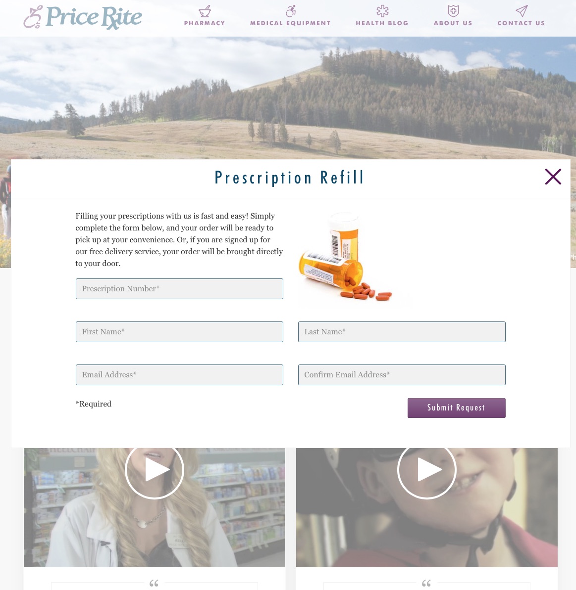 For the new upcoming Price Rite Drug site, we implement multiple slips so that customers can fill out a survey, a consultation appointment or prescription refill form without leaving the page they were on.
Drawer
 In our content management system, My JTech, drawers are a great way to manage records of articles. You can add a new article and view, edit or delete an existing one all in the news drawer.
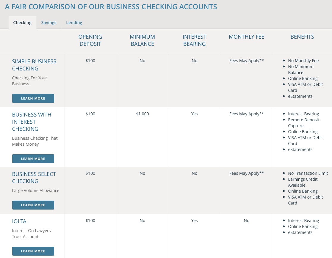 Because they are ideal for effectively dividing content into categories, we organized Bank of Bozeman’s account types into easily browsable tabs. All are organized on the same page, but grouped into sections, and can sometimes have their own unique URL.
 Again, due to Bank of Bozeman’s robust categorical information about their different business and personal banking accounts, a palette was ideal to utilize in their primary navigation. By hovering over one of the menu items, you can view all of the secondary navigation options on that page beforehand on the palette.

We enjoy not only helping to elevate your organization to success, but also educating our customers about the intricacies of our industry. The following list is a compilation from our team of some typical interface jargon you may hear us use from time to time.
Page (webpage)
A page is a web document that is usually written in HTML, or a similar code, and is displayed on a web browser. After the page loads, a single page consists of everything you can scroll through. Navigation to other pages is possible through links on the present page or by your browser’s navigation back or forward buttons. From our very own homepage, to an article on Wikipedia, anything displayed in a web browser can be considered a page.
Element
An element is a generic term for any distinct visual object on a webpage. It usually refers to smaller objects; for example, a slip would not be an element, but the “submit” button or block of text on the slip would be individual elements.
Primary Navigation
You will find the primary navigation at the top of nearly every website. This will include the key navigation elements, such as About Us, Products or Contact Us. Primary navigation allows visitors easy access to exactly what they are looking for without having to search. What to place in primary navigation is often up for debate. While others insist on keeping a “home” navigation point in the primary navigations, others have done away with it through the years.
Secondary Navigation
Secondary navigation is for content that is of secondary interest to the user. It can contain any content that does not serve the primary goal of the website but that users might still want to access easily. For some websites, it may be a preliminary list of their product categories, driving directions or a feedback form.


Footer
A footer is the bottom section of a website that can contain important information, such as a site map, primary or secondary navigation or other navigation points of importance. It also typically contains attributions as well as relevant copyright information.
The important thing to remember about the footer is that its existence is usually expected by users. When they are lost, or deep in the pages of a long webpage, the footer is often a place of recollection, where visitors expect to find certain information about a website. We usually include a site map in our footers, or a link back to the home page to eliminate any frustration.

A footer can be incredibly useful in the case of infinitely scrolling pages of content by fixing it to the bottom of the page. A fixed footer, especially one with a home button or site map, can help orient a visitor back to where they want to go without having to tediously scroll through the content they’ve read.

Slip (overlay)
What we call a slip is more commonly referred to as an overlay by other developers. This technique is not a separate page that is opened, but rather an element that overlays on the existing page. This element can be semi-transparent, creating a nice effect that lets the user know that they can get back to the page underneath once more by closing the slip that is on top. We treat our slips as separate pages, each with a unique URL that can be navigated through as well as bookmarked, making it easy to share photos, product or article detail and submission forms. They are particularly good for delivering content that is an “aside” to the focus of the user.
In some cases, the user is able to drag and place it anywhere on the page. We tend to make our slips modal on all websites. Modal slips, by definition, render the rest of the layout unusable; they take priority on the screen and force you to take action before you can use anything else. Our slips, for instance, are modal, and must be dismissed before accessing navigation.


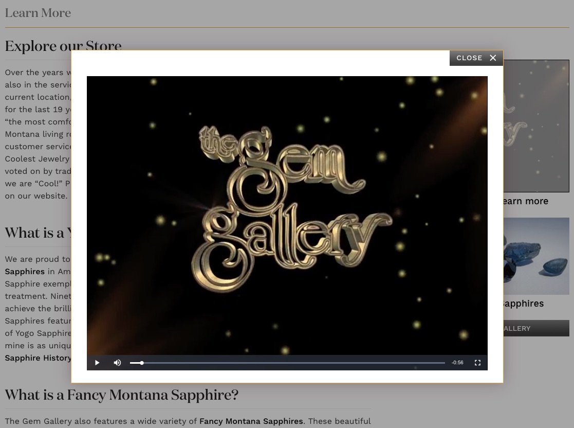
The Gem Gallery features a company video slip that can be played from their About Us page without interrupting your navigation through the site.
Drawer
Drawers, while they appear like a page, are a page-like construct that slides over the actual webpage, attached to the browser on one complete side. They are useful when you have enough information that it covers much of the content underneath; too much content to fit in a slip. Drawers slide out in the screen at the user's request (sometimes pushing or covering the underlying content), then slide back out of the way when no longer needed.

Tab
A tab is a design pattern where content is separated into different panes, and each pane is viewable one at a time. The user requests content to be displayed by clicking or hovering over the content’s corresponding tab control.

Palette
A palette floats on top of content and offers ready access to more robust tools, commands or useful information. They can also contain instructions or tips when an element is hovered over. A palette is also like a slip, except that it is anchored to another element at one point, in this case, anchored to the menu item you hover over. While our slips are usually modal, palettes on our sites typically are not.

Inline
ElementAn inline element pushes content out of the way. In Google’s image search, when you select an image to view the other images are shoved aside in order to make room for the selected image’s details. Inline elements are particularly preferred on mobile devices.

An example of an inline element is our advanced filtration system for The Gem Gallery. This dialogue, instead of covering existing page content, pushes the items down as it slides and the product results update based on the filters you choose.
Pop-up
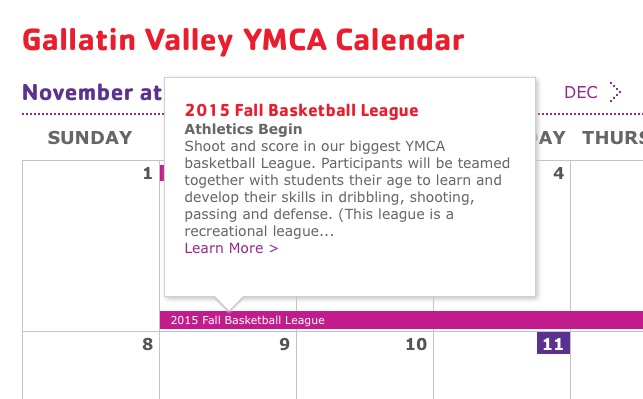
A pop-up is a small display area that suddenly appears in the foreground of the visual interface. Pop-ups are usually initiated by hovering your cursor over an element and are useful for displaying additional information that is helpful to visitors without them having to leave the page they are on. The main differentiator between a pop-up and a palette is that the former is usually a quick glance at minimal information and are anchored above their related content, while a palette displays more robust content and is more likely anchored below.

Our interactive calendar for the Gallatin Valley YMCA uses pop-up windows to allow users to obtain more information about events with the option of leaving the page.
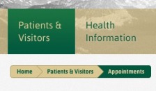
A breadcrumbs trail (also known as a rabbit trail) can be used to show your location in a multi-step form or deeply layered navigation. The trail is made up of links, usually at the top of the webpage, that describe your position in the site’s hierarchy in an unobtrusive fashion. This can help alleviate confusion for sites with numerous navigation options or different departments.
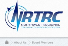
We applied breadcrumb trails to both Estes Park Medical Center and the Northwest Regional Telehealth Resource Center websites. Estes Park, because they are a hospital, have a number of departments to navigate, organized in a secondary navigation; their breadcrumbs help show users their position through these departments. NRTRC hosts annual conferences and their site supports the robust information they provide for conference attendees, making breadcrumbs an effective application here as well.

Bridging the Gap
Communication is vital to form a strong working relationship with our clients, especially during planning. In order for us both to see the same vision for your finished product, some basic technological design terms can really help to bridge the gap between you and our team members. When we’re both speaking the same language, we can better define what you want out of your organization’s online presence and translate that into a highly-functional, advanced website.
We look forward to writing future articles highlighting the different terms we use in the web development, design, planning and marketing processes in order to continue our campaign of industry education with you.

