
Designing Responsively
An introduction: shiny things, negative space and usability.
As JTech’s designer, I’m the visual voice behind the curtain of almost all our recent websites. My formal training is in visual graphic design, but my youth was squandered tinkering in ResEdit, hand-coding HTML, and deconstructing user interfaces. I’ll be making regular contributions about the graphical aspects of modern web development for the JTech Technical Blog.
Early in 2011, JTech hired me on as a human interface designer. Great job title — and a promising description of the kind of work I hoped to be doing. The workflow in those early days working with JTech will sound familiar to seasoned designers; I arranged every pixel into Photoshop comps to share with our clients. With the client's approval, our development team chopped and optimized my comps into HTML, CSS and javascript.
Fast-forward to the present.
Two years and many workflow iterations later, we're reorganizing almost everything to accommodate an internet that's changing dramatically as we watch. The size and shape of devices used to reach the internet has become wildly variable; in fact, the only thing we can (generally) count on is that our work will be presented in a frame that resembles a rectangle.
Here's a guiding statistic: 45% of all 18-29 year olds who use the internet on their phones do most of their online browsing on their mobile device. That's enough to make you stop and think — will the website you designed for a conventional monitor turn people away when they try to use it on their phone?
Responsive web design.
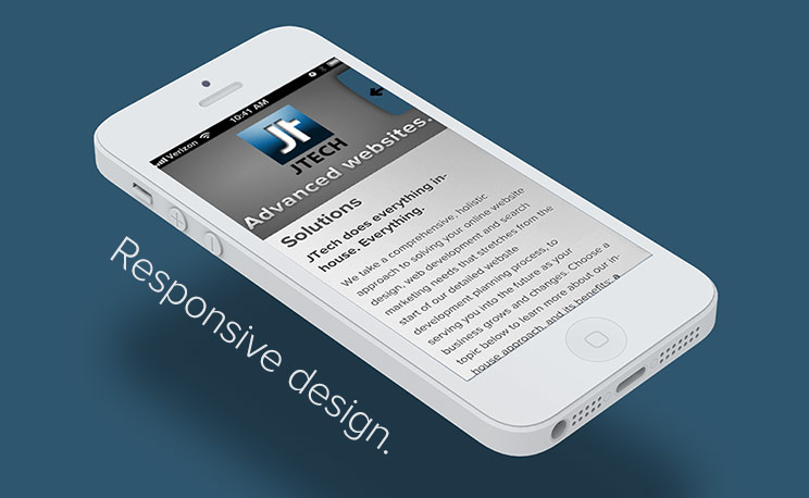
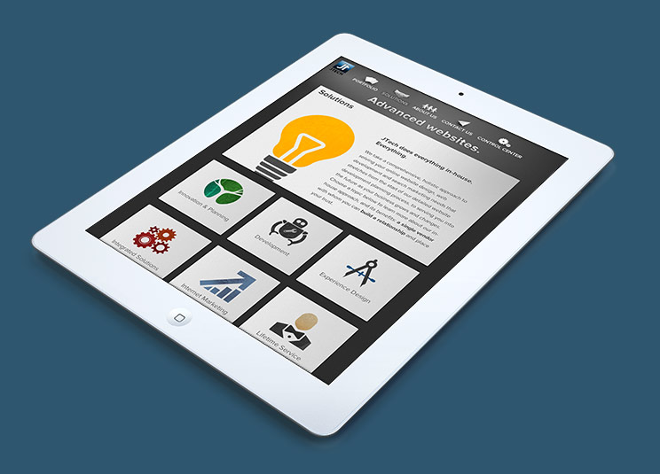
There are a few solutions to the problem of providing an optimized experience on multiple screen sizes, but we’ve chosen responsive web design, an approach that delivers a single build that responds dynamically to the size of the screen being used. Responsive sites rearrange their layout and resize their text and images to provide a readable, beautiful experience at any resolution and on any device. The latest draft of our own website is the first site we've created that adopts responsive design principles, albeit with more “break points” than we’ll usually produce on client work.
Responsive problem-solving.
As a designer, I'm scrambling to adapt to the challenges posed by responsive web design. Most of my challenges involve thinking in different viewports — rearranging, scaling, and showing or hiding elements of the website. Photoshop‘s role in the design process has been reduced— it defines the visual polish of the site, but plays a subordinate role to wireframes and behavior prototypes, where most of the work is done.
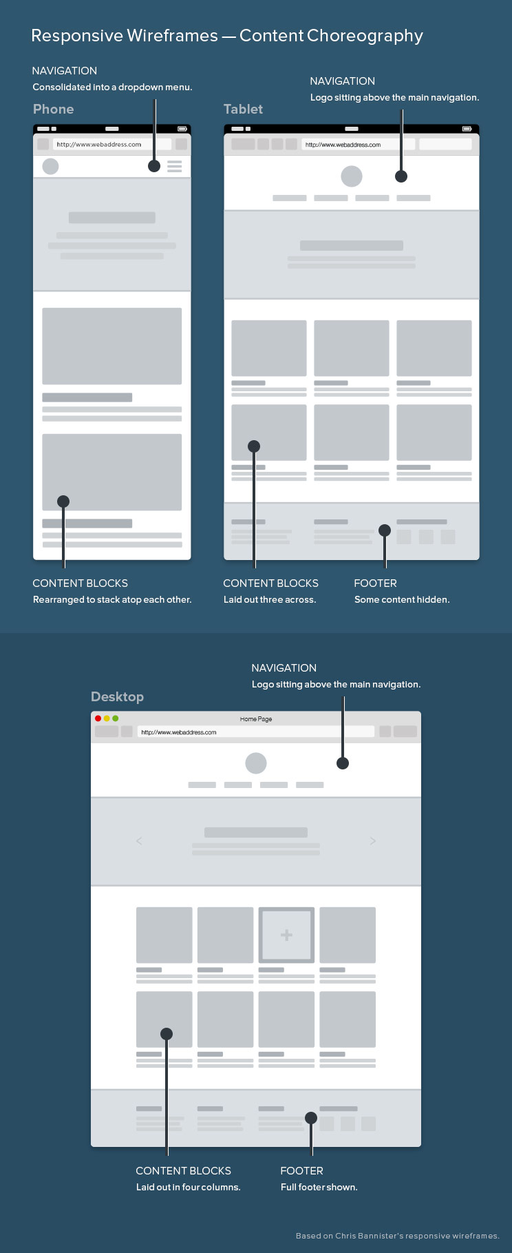
The puzzle of rearranging a website is sometimes called content choreography. This process gives the content a larger role in defining the design, because one of the earliest steps in developing a site's layout is determining the hierarchical importance of content — and which pieces of content need to remain associated with each other when the site is rearranged.
Scaling is a large part of content choreography. Should I scale the whole box, or just the content within it? Considering scaling has initiated changes in the way I create assets for the web. Because typography is universally-supported and fully-scalable, we've begun to build custom symbol-fonts for our new web projects (we started by using Fontello as a springboard). I collaborated with Patrick, our VP Technology, to build a symbol-font for the JTech site that we employ for our arrow buttons and close Xs. It not only scales well — it’s also lightweight and is easily animated using CSS. We've experimented with SVG and CSS shapes, but we’re limited by browser support and performance from using them extensively. On the latest iteration of the site we use CSS gradients in some places while employing raster images elsewhere to keep things snappy.
When our sites are viewed at extremes on either end of the spectrum — within very large and very small viewports — we need to do more than rearrange and resize the elements of each page's design. Perhaps the most common example of hiding complexity is primary navigation, which is often tucked away behind a menu button when the site is being viewed on a mobile phone or in a small window on your computer. Look at our website to see this in action — and see if you can spot some of the other content we hide for the mobile breakpoint of our site.
Redefining the workflow.
Our workflow continues to evolve as we change our web development goals. Layout is defined by wireframes — three different sets, at breakpoints for desktops, tablets, and mobile phones. Our wireframes are heavily annotated, with descriptions of how the site's design will morph as it deviates from our pre-defined resolutions. An example of this behavior: as the window gets bigger, column width may increase, the space between columns will grow, and the imagery will always scale so that it exactly fits properly. I want our websites to flex and grow naturally and look nice — even for scenarios that I haven't considered explicitly.
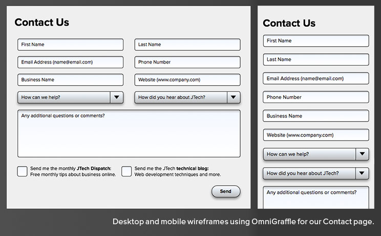
We use OmniGraffle (by the OmniGroup) to create our wireframes. It makes diagramming and layout simple — and most importantly, makes it easy to change things on the fly. For static layout, I find that OmniGraffle represents everything that Photoshop lacks. We augment these wireframes with behavior prototypes for interaction and animations, experimenting with tools like Adobe Edge and After Effects. This aspect of our workflow is very new and my own confidence in animation design is gradually growing as we integrate interaction into our designs.
Our workflow extends beyond our office — and beyond the goal of building a website that looks great regardless of the device. We also need our clients to understand what it means for their website to be responsive. When our clients are on board and understand that their website’s layout isn’t static, they will be better partners in defining the content and its hierarchy with us — in turn making their website an effective piece of communication. As I become more experienced designing responsive websites, I will in turn improve at articulating the responsive experience to our clients and how they should think about their website.
OK, so we're still figuring it all out.
The wild pace of change is what makes being a human interface designer exciting. Unsolved puzzles, new frontiers, and new details abound. I know I’ve just scratched the surface, and I’m eager to see what’s around the next bend.
I'm enthusiastic about all the changes coming down the pipe, and I'd love to hear from people who’ve experienced making the shift to responsive web design. If you can help us avoid your mistakes, even better! Drop us a line — we’d love to hear about your responsive design experience.
